Disclaimer:

Some of the products used on my blog may have been provided by the vendor mentioned in my posts

Friday 30 November 2012

Thank You Card


A simple thank you card ready for those post Christmas needs. Just two texture stamps were overlaid, followed by this sincere woman saying "Thank You". She comes from the Nature Notes stamp plate and I love the way she looks you straight in the eye! The stamp plate comes from Rogue Redhead Designs

Saturday 3 November 2012

Home Decor Inspiration with Unruly Paper Arts


The inspiration for November at UnrulyPaper Arts is Home Decor. I have used the challenge to create a decorative yet useful key rack. There are some other great ideas so do come by and join in the Readers Art Quests. Hope to see your inspiration over there!

Tuesday 30 October 2012

Stampotique Case Inspiration


We are to use one of Stampotique's designers as the starting point for our creation this week. I used Kim Howard for the simplicity of her piece and the similar amount of white space in her card...Ok mine is brown space but you get the gist.

It was my daughter's 18th last week so I felt Cone Hat made a very good flame for the candle.

Friday 26 October 2012

Rogue Redhead: Playing with Tape and Stamps


Today I had a little play with masking tape, tissue tape and an autumnal sunflower stamp. Hop over to RogueRedhead site for more details.

Monday 15 October 2012

One colour at Art Journey


The challenge at Art Journey is to use one colour. Give me a rule and I will bend it but not break it. My one colour is shades of mud. I did only use one ink pad, so in my eyes I have just bent the rules not broken them. I just thought this looked wonderful in these mud colours that are so near monotone it must be OK. I also thought the images worked superbly with this colour.

The stamp images were layered at different heights adding dimension and small white pearls added to the ornament and string.

Sunday 14 October 2012

Weathered Canvas


There is a tutorial over on Unruly PaperArts on how to achieve this texture and canvas. Just follow the link.

I am also entering it into the Stampotique Weather challenge since the terms of their challenges have changed recently. Follow this link to see how these terms have changed. It is not too late to join in.

Saturday 6 October 2012

RAQ: Unruly: Dimension to Canvas


There is a new RAQ challenge over on Unruly Paper Arts to add dimension to a canvas.
The harlequin background is raised and there will be a tutorial on how this was done on the 9th. Colourwise I challenged myself by pulling three colour cards out of Claudine Hellmuth's The Scrapbooker's Creativity Kit: Prompts And Ideas To Jump Start Your Layouts. Then I chose some stamps which I hadn't played with for a while.

Do come and join the challenge.

Friday 28 September 2012

Wings with Art Journey

To See the World in a Grain of sand

I so love this image from Art Journey. It depicts the absolute wonder that small children have in the smallest of things. How we loose this wonderment far too soon and take things for granted. Hence the title "To see the World in a Grain of sand".

This little fellow is surrounded by Bermuda pink sand and he is fascinated by the tiny shell and coral fragments that are in it. This is what gives the sand it's wonderful pink colour, which Bermuda is famous for. Most of the sand is much finer than this. I collected these coarser pieces especially.

He is such an angel the wings were a perfect addition. The theme at Art Journey is Wings.


Friday 14 September 2012

This Delicious Solitude


I love this new stamp plate "Nature's Notes" from Rogue Redhead Designs. It has such a reflective feel to it.

I decided to stamp this lovely image onto paper that would reflect the start of a beautiful sunset. Then layered it onto some pinky coral paper to enhance the pink sky at night feeling. Very little else was needed especially with this apt saying. Anything else added would disturb "this delicious solitude."

Thursday 13 September 2012

Colour Challenge with Stampotique


Laughter is the Best Medicine

Jane over at Stampotique has given us a colour challenge this week. The colours are Navy, Orange and Mustard. I thank her for the combination as it is a fabulous one, that works real well.

I have used Daniel's Hearts and Smile together, masking smile and over stamping with the hearts. Added white gel pen to make the eyes and teeth pop more. Coloured in the hearts roughly to define them with orange, and there you are: Laughter is the Best Medicine.

Monday 10 September 2012

Combining Stamps with Stampotique


Sugar & Spice
And all things nice!

Combining stamps is this weeks challenge over at Stampotique. I had fun using Marci along with Conehat to create this birthday card for a dear friend of mine!  Fun was had and I added a Love Heart to finish it off.

I also used:
Abstract Foliage
Swirl Stalk
Daisy, Daisy 

Tuesday 4 September 2012

Eggplant/ Aubergine Colours with Stampotique


Aubergina, Aubergina tiny little thing
Aubergina dance, Aubergina sing.
Aubergina what's the difference if you're very small?
When your heart is full of love nine feet tall!

Yes, my sense of humour to the forefront again. But this little tune seemed perfect for these colours and project.

Sarinda at Stampotique has challenged us to use eggplant/ aubergine colours. I had great fun playing yesterday with inks and paints etc.

The stamps I have used are: Moon Girl; Giant Shroom, Group of Shrooms, Abstract Foliage, French Text, Swirl Stalk. I also added Sakura Glaze pens to the Mushrooms and Moon Girl too.


Monday 3 September 2012

4 x 4 collage with Unruly

Archi - texture


There is a new Readers Art Challenge at Uruly PaperArts, which is to create a collage on a 4 x 4 inch format.  This is what I created. And because I enjoyed it so much I also created this one below. All about Freedom!


Freedom

Sunday 26 August 2012

One Layer Card with Stampotique


Gez, over at Stampotique, has given us a challenge this week to create a one layer card.  I had great fun creating this.

I used core paper which I layered a stencil over and sanded the gaps so giving the above effect of shading. I stamped Spider Girl with Black Soot Distress Ink and clear embossed her. Coloured her face and stockings with Promarkers. Stamped the words with a small alphabet set. Outlined the tress and embossed with Silver Pearl embossing powder. Darkened the edges with Vintage Photo Distress Ink and there she was standing in the woods with her friendly spider. Not frightened away at all.

Tuesday 21 August 2012

Alter it with Stampotique

Quail Spectacle Case


For this challenge at Stampotique I decided to alter my spectacle case. First I coloured it with alcohol inks. Then I stamped the quails onto tissue paper with Memento Black ink and coloured with Promarkers. Images torn out and stuck down with watered down PVA. 

I will never mistake my spectacle case again.

Monday 13 August 2012

Sketch with Stampotique


I had a half hour play this afternoon and came up with this using the sketch challenge over on Stampotique. I rather enjoyed my little play and having  sketch to work to. For the ribbon section I have used a Tim Holtz die and set it proud above the card. I seldom use sketches, but I am not quite sure why?

I have used Strut Your Stuff, Flowers and Kisses from Stampotique.
The words "Live in the Sunshine" are from an Artistic Outpost plate which I enjoy to use.

Monday 6 August 2012

Birds and Buttons with Stampotique


Peace


I have used a number of Stampotique stamps for this Birds and Buttons challenge. I have this paper pack that I really like and one of the images on the sheets is this girl with balloon. So firstly Star Bird was stamped beside her approving of the message she is sending out on her red "P" button balloon. I then created these imaginary birds with one of the Two Sticks. How I have used this stamp. It must be one of my favourites of all times.  Then created wings by using a heart from the Heart Cube stamp. They are double layered. Firstly stamped onto the card beside two sticks and then layered with iridescent foil. The buttons have the letters P E A C E stuck on them and placed on the balloon and the wings. The Peace sentiment was the starting point of this thought process along with the challenge,  Birds and Buttons.


I would also like to add this piece to Word Art Wednesday where by coincidence the theme is Peace,  and the second coincidence is that I was left a lovely comment on a previous post that highlighted this challenge to me. I like coincidences, they are often very special. So thank you.

Hope you enjoy.

Wednesday 25 July 2012

Garden Party

UPA has been running a Trinchie swap, subject:  Garden Party.

Due to one thing or another I am a tad late posting these. But here we go at long last....


And these are the ones I have already received from Petra Berendsen which are just gorgeous...


Friday 20 July 2012

Garden Tag


A sneek peek of a new creation over on The Rogue Redhead site. There is also a super summer sale on the stamps at the moment so why not take a look!

Saturday 7 July 2012

Catch the Wave with UPA

Catch the Wave

I am a bit tardy with posting this. But there is a new month at UPA with a new theme of Beach. The first Art Quest is to use the theme "Cacth the Wave". I think this must be my favourite Crafty Individuals stamp of all time. It catches such glee, happiness, friendship and the simple joys of life. Everytime I look at this image it speaks these memories to me.

When I was young our family often holidayed in Cornwall. This was before it has become as busy as it is now. We used to either camp or rent a cottage. Often we would rent in St Ives, again before it became as popular as now. With my family we have taken to going to West Wales. This too, sadly, seems to be becoming the new Cornwall for holiday makers and is becoming busier every year. It is not our holiday destination this year. All this blurb is bringing me around to highlight the fact that I have used part of the West Wales map as a background for the card. I liked the idea and it felt personal. The card the image is stamped onto is one of my acrylic ink backgrounds that I make. The splatter stamp is such a versatile and useful stamp , one I use more than any other, comes from Stampotique and was designed by Jo Capper-Sandon. Their stamps are available in the UK from The Stamp Attic and Happy Daze.

If you would like to join in this Readers Quest take a jump over to UPA. There are some great tutorials too. We would be glad to see you there.

Friday 6 July 2012

Party Invitations


Rogue Redhead Designs have done it again with this new stamp set called Getting Grizzle. As I was thinking up a new way to use them the idea of children's party invitations came to me. What fun and you get your child to join in by getting them to colour in the bears. They would really feel a part of it and they would be even more personal too.

Monday 25 June 2012

Twin Images with Stampotique


When the Wind Blows is my contribution to twin images with Stampotique. I was challenging myself to use the brief in an unusual way. I decided to try and portray flowers blowing in the wind, which is very noticeable if you have ever tried to photograph them outside.

I used a canvas the wrong way round so I could give myself some depth. Stamped the large flower image both onto the background and also onto mylar with Stazon. As you can see the mylar is hanging on the two pins outside the recess so giving a feeling of movement as you move in front of the image. I wanted to do something outside the box: forgive the pun. Not easy to capture this in a photograph. Little red Moon Girl looked perfect sitting on the flower and with this technique she really does look like she is sitting in the flower.

I am not sure whether with this second image you get what I mean?


Friday 22 June 2012

Bear Hugs with Rogue Redhead Designs


Couldn't you just give this poor little bear a hug? Those nasty bees are tormenting him. It looks as if he may have been stung?

This is one of the new stamps available from Rogue Redhead Designs just follow the link. I am quite fond of telling a tale when I stamp and with these stamps you can't help but do so. The bee is also from the same plate.

I coloured the images with Derwent water-soluble pencils. I left them as crayons but turned the shadow into paint by adding water. When it came to the bees wings I came up with a cool idea, at least I thought it was nifty. I added a spot of blue and a spot of green sparkly Sakura Gelly Roll ink and then immediately spread the colour with the clear sparkly pen that they have in the range. It gave a wonderfully subtle and soft colour that was like gossamer.

Monday 11 June 2012

Bright Colours with Stampotique


The current challenge over at Stampotique is Bright Colours.

I think this speaks for itself... Get it?

A clean and simple card but a joy to make.

I do love this 3 Smiles stamp!  So quirky!

Sunday 10 June 2012

Nature's Shadows with UPA


I have written a new tutorial on how to create your own Nature's Shadows over on the Unruly Paper Arts site. If you are interested then please follow the link to UPA.

Friday 18 May 2012

My Treasures of the week with Brenda Brown


This is my treasure. A hammered Acer leaf onto white cotton. Quilted with free machine stitching onto   the leaf. Little hand stitches added around the leaf for further quilting. Stretched and stitched onto a handmade twig frame and weighted with a shell.

Natural objects, for me, have such a beauty which is seldom surpassed.

The challenge is open until May 20th so there is still time to add your treasure to Brenda's blog: Bumblebees and Butterflies.

Family with Stampotique


Yo yo my big bro

This is my contribution to the current "Family" challenge at Stampotique.

I have 3 brothers. My mother married twice which resulted in my having 2 much older brothers. There was about 13 years between us. I had one brother who was very tall and I had to skip when walking with him just to keep up with his long legs. I thought the size difference between these two really depicted this difference and gave me fond memories during its make. And what fabulous large feet he has. Perfect, as I used to stand on his feet and we used to dance around the room together.

Tuesday 15 May 2012

Shattered Stains: CCC5


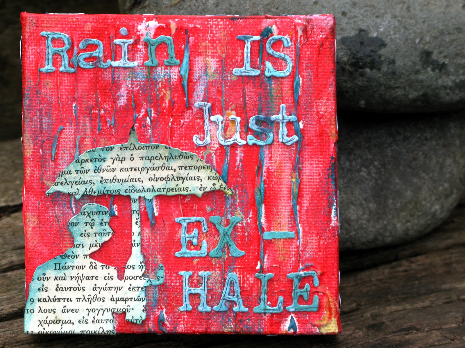
Linda, from Studio3L, has set us a new challenge this week called Shattered Stains. The details of this technique are available from Tim's new book,"Compendium of Curiosities Volume 2."

A fun technique, but I had no idea which die to use to try it out. I had a light bulb moment when I was looking through them. Since the technique is a wrinkly crackly finish, I thought of skin when it has been in the bath too long. Fond memories came flooding back to me of bath times with babies and toddlers. Always magical and they can just stay in that bath for ages when they have fun toys to play with. Watering cans to fill bottles, wheels that spin when powered by water, squirty toys and that must have, a wind up toy of some sort. Just a few of the toys my children had. Bath time was so special that I used it even in the middle of the day if they became very distressed or when temper tantrums struck. If your children are at this stage, just try it and see if it works for you and them. Afterwards they tended to be wrinkly, cuddly and much calmer. All to be finished off with a cuddle and a bottle of milk and with any luck we both then could have a little snooze together.

This cherub die is a delight. I can just remember the silky feel of babies skin, the wonderful chubby bums and limbs and the most evocative smell. Mmmmmm, one day I may be a grandmother, but apart from the odd lapse I am in no hurry. I would much rather my children to enjoy their young adulthood first.

Simon Says Stamp is the generous sponsor again this week.

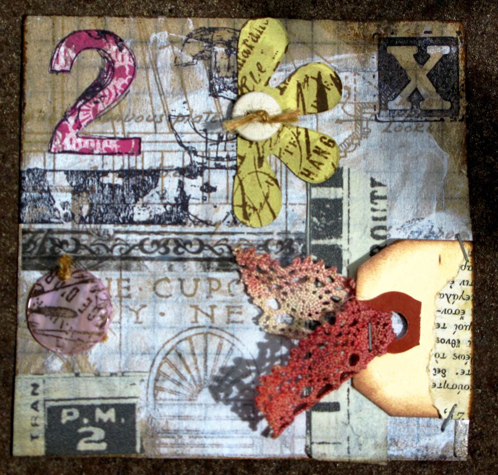
The post below this one is my make for the CCC4 challenge. I knew I would not make the deadline, but  I would love it, even so, if you took the time to view it. It was such a great technique which I thoroughly enjoyed and one I will definitely use again.

Friday 11 May 2012

Compendium of Curiosities 2, Challenge 4: Faded Layers


What a hectic week. Here, there and everywhere. I knew I would probably not be able to make this until Friday, but that is fine. I am at least keeping up with the challenges and it is great to actually try all the techniques in the book. Compendium of Curiosities, Volume 2, page 43.

I will not give away the technique as it is all in the book, but what a great effective technique. I really enjoyed myself and I just love this elephant. Elephants must be one of my favourite animals. Gentle giants unless annoyed. If I were an elephant I maybe able to remember more? At least I wouldn't forget.

If you do not know these current challenges then hop over to Studio3L. There is a new challenge technique every week.

Friday 4 May 2012

Rogue Redhead Vintage Pastels


Whilst making this I thought the colours reminded me of Vintage Pastels. What do you think? I guess some of the squares may look more like Grungy Pastels?

However I found a fun way to use the Rogue Redhead design plates in an alternative way. I think it is rather fun to create a mosaic type card by using a variety of the images. There are some great makes over on the site so why not take a browse. Just click the link.

Thursday 3 May 2012

ATC Stampotique Challenge


Just recently I have been trying out a different genre of stamps from Stampotiue. I felt this photo booth stamp was ideal for the current challenge to make an ATC. I also decided to go for a monotone design as photo booth photos used to always be in black and white. I also like to create in black and white from time to time as for me it is a bit like cleaning my pallet.

Tuesday 1 May 2012

Marbled Stains: CC2C3


This week over on Linda's blog, StudioL3, we are tackling a new technique from Tim's newest book, Compendium of Curiosities volume 2, page 46. I decided to try the technique out on a tag. Once dry I added further texture with the new texture stamps and distress ink. I really like the Stormy Sky with the Frayed Burlap colour. There is something about blue and brown together which I really like, or am I just reflecting the colour of our weather at the moment?

Once all this was dry I added some more stamping with Tim's word and number stamps. I added the Converse Sneaker stamp as I felt it was appropriate being a stamp I designed for the Artistic Stamper. As it was sitting on this muted background I decided to add some white highlighter pen to lift the white areas and I went around some of the edge in yellow, green and fuchsia pink coloured pencils to lift it further and make it feel more 3 dimensional.

The sponsors this week are Eclectic Paperie. Aren't we lucky, not only are we inspired to play but there is a prize too for the lucky winner for this weeks sponsor. Thank you!

Wednesday 25 April 2012

Faux Patina: CC2C2


What an amazing stamp! It was one of the first I ever bought and was a doorway for me getting into rubber stamps. So wonderful to use again! And what better way than by using Tim Holtz's Faux Patina  technique that is illustrated in the Compendium of Curiosities 2 page 58. I created mine onto his new stamping card, which is also amazing. I am a complete convert. It really does make a difference.

I did not have snow cap alcohol ink so I used the pearl and bronze mixatives as an alternative solution and I really like the subtle effect it has created.

I also love these words to go with the image. Perfect for such a genius!


Both these stamps were from Rubbadubbadoo a number of years ago.

This challenge is being hosted by the fabulous Linda over on StudioL3.
A friend of hers, Angie Lentz is offering an idea-ology messanger bag as a prize autographed by the man himself! How awesome. For sure someone has to win the goodies.

Monday 23 April 2012

Shopping Time!


How exciting! I am the lucky bunny who won the first CCC2 prize sponsored by Simon Says Stamp. Thank you again Linda for organizing the challenges over on StudioL3. Time for shopping!

Friday 20 April 2012

Rogue Redhead Rebel Challenge

There is a challenge running over on the Rogue Redhead blog to use Spring fashion colours as set by Pantone. Click the link to take a look. The challenge runs until May 7th.

I have used a stamp from Rogue Redhead Designs from the Carnival Dream plate. I coloured a piece of stamboard using Tattered Rose, Dried Marigold, Victorian Velvet and Wild Honey. Then Spiced Marmalade was added through sequin waste. The image was stamped with Archival ink and then painted using a watercolour brush and Distress Inks. Finally I scraped the edge to give the white surround which also makes it look more like a tile.  Made a tag from some Crafty individual paper which I coloured further with inks so the tile would stand out more. Added the trim and ribbons to finish.

There are some great colours to choose from in the Pantone Spring Fashion collection so why not take a look.

Thursday 19 April 2012

CC2C*1: Custom Foam Stamps


And the Moon was made of Gold: Rickie Lee Jones

This is the first challenge from the second volume of Tim Holtz book Compendium of Curiosities. Linda at Studio L3 is hosting the challenges and this week Simon Says is the generous sponsor.

The technique comes from the above mentioned book from page 66.

I think I have added my own twist on the technique as using the stamping as a base for a fabric collage. (The foam I used had this wonderful texture on it, which I think is lush. It creates a sort of kiss stamping technique all by itself!) As you can see the title came from a song written by Rickie Lee Jones- she certainly performed the song I am assuming she wrote it as well? Apologies if I have this wrong.

Wednesday 18 April 2012

Oodles of Doodles with Stampotique


Matching Shirts

The Stampotique current challenge is Oodles of Doodles which I have incorporated with this image from Stampotique. It is because of this stamp that I have made this journal type page, as in fact it runs true for me. John and I both really like Breton stripped shirts so when we were in a chandlers in St Malo, one time, we came across stripped Breton sailors shirts. So of course we both had to have one. I hope you can see that most of the image has been stamped with black ink,  but the stripped shirts are in navy blue. 

Saturday 14 April 2012

Sunday Stamper Week 200


Hel's Sunday Stamper has reached the 200 mark! Wow! So the challenge this week is to use numbers in our creation. I know what a fan Hels is of Wendy Vecchi so this has been made especially for Hels! The Queen of Wendy Vecchi Style. Hence the images and the words and do not ignore the Thinking of You list at the top and I purposely ticked "You are Special" in tribute to Hels being such a swell person.

Fingers crossed as the booty is so lush!

Tuesday 10 April 2012

Dictionary with Art Journey& PDCC 126


Enjoy Every Moment

This is my contribution to the April Art Journey challenge. As you can tell I could not keep my hands off Filmboy, yet again.  Created another collage, which seems to be my favourite thing to do at the moment. Love playing with colour, texture and pattern. I used numerous other Art Journey stamps too. Plates used were: Grunge; Pages; Nature Flowers; Filmboy

The colours are also relevant to the Play Date Cafe Challenge:


So I am very pleased to join in their fun again. It feels like an age since I have!

Related Posts Plugin for WordPress, Blogger...